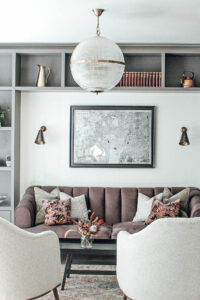
INTERIOR VIEWS WITH ROSE + GEORGE
The London based interior design studio, Rose + George was founded by Kristen Georghiades and Harriet Tuohy. Recognising the need for design studio’s to be less intimidating, their clear vision was to make beautiful yet highly usable interiors. Pure White Lines spoke to Kristen to find out more…
About Rose + George
We started Rose + George with a mission to make the design process something that is approachable and inviting for everyone. Rose + George was started back in 2015 with me (Kristen) and Harriet after both reaching a crossroads in our careers. Bringing Megan on board back in 2020, she brings a new design perspective to the team, as well as being a CAD and visual presentation professional. We know the design world can be intimidating and exclusive. We want to go to as many places, see as many things, meet as many people as we can and then come back to share it with our clients. Our main client base predominantly consists of busy, working families looking for designs that are practical and beautiful. The majority of our projects are based in London, but we have worked in Oxfordshire and remotely with clients in the States as well as Geneva.
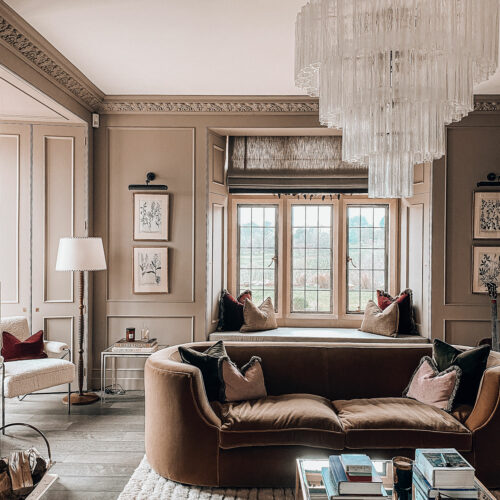
Left: A vintage sofa sourced and reupholstered by Pure White Lines, also pictured is our Baa Baa armchair in white sheepskin
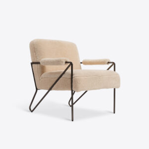
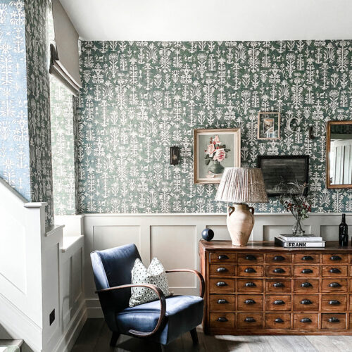
Right: A vintage bank of drawers and Halabala armchair sourced by Pure White Lines
Blended interiors
We have quite a niche aesthetic which draws a clientele looking for an eclectic blend of rustic, scandi and glamour, with a bit of rock n’ roll. Most of our clients come to us wanting to be pushed outside of their comfort zones or they already have a vision and just need a bit of support helping them pull it together by sourcing the items to bring the vision to life.
Favourite room to design
I’m not sure I can choose this!! Kitchens because they are the heart of the home, where everyone gathers for a nice meal, a cup of coffee or a glass of wine. Kitchens are so technical, yet you want them to be beautiful, so they are always a lovely challenge. It gives you the opportunity to incorporate hard materials like flooring, tiling, worktops and then finishing off with opportunities for statement lighting. But I also love to design a space for a child in mind. A bedroom or a playroom, where you create a space that can evolve as they grow, which sparks creativity and play, while staying true to stylish design.
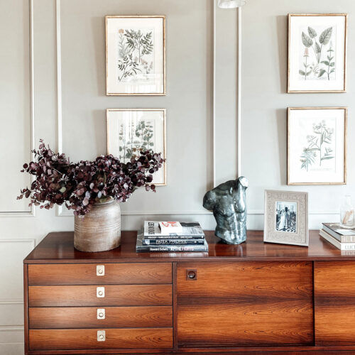
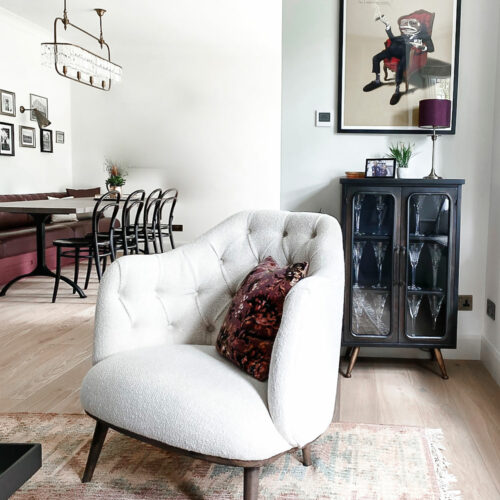
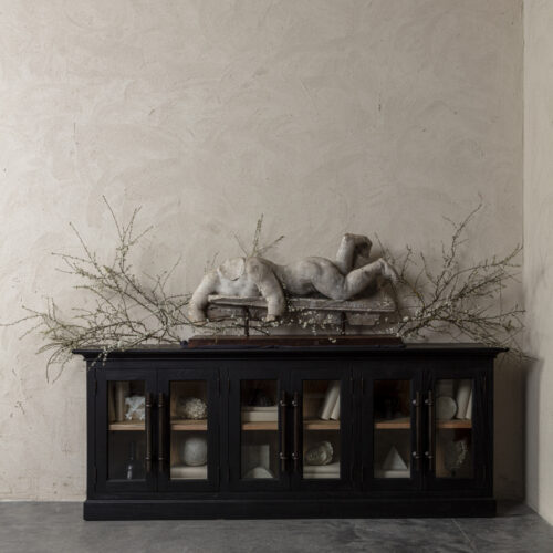
Left: A vintage sideboard sourced by Pure White Lines
Weaving the old in with the new
We are true believers in weaving the old in with the new. Vintage furniture just tells a story that other pieces from the high street can’t tell. Like with anything you incorporate into an interior, you just need an element of a vintage piece to speak to the room as a whole. Whether it is an old industrial light pendant, which can add a sense of industrial glamour to a kitchen or the curves of a Halabala chair softening the straight lines of freshly plastered walls; old pieces bring a new dimension into the design of a room.
Tying a space together with art
We love an asymmetric gallery wall while really mixing photography with sketchy drawings and paintings on canvas. Art can really help tell a client’s story of who they are, where they’ve come from and where they’ve been. When styling shelves and other surfaces, mixing framed prints in with decorative objects, not just books, adds a sense of layering and sophistication. These last decorative touches truly tie a space together and give it a bit of pizazz.
Lighting – the designer bag of the interior world
For us, lighting is the game changer in a space. Lighting is to an interior what a designer handbag is to an outfit. Once we have gone through the space planning phase of a project, we then layer a lighting plan on top of this. Ceiling pendants, then wall lights or picture lights and then once the furniture is sorted, we layer in floor and table lamps. For each room we design, we start with one leading item that speaks to us. Sometimes it is a tile, sometimes a sofa, sometimes it is simply a colour, but oftentimes it is a statement light that drives the concept design. Whatever the item is, we layer everything into the design based on whatever it is that makes us most excited.
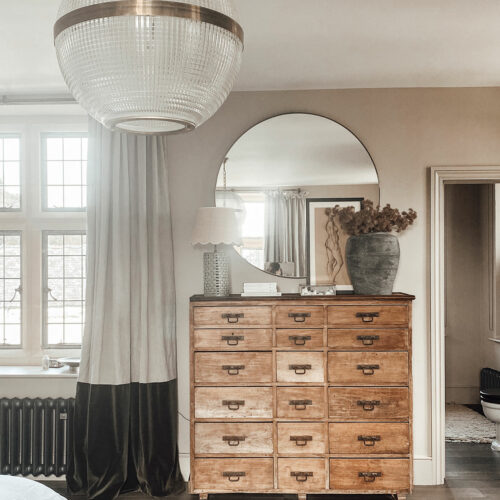
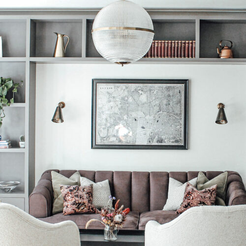
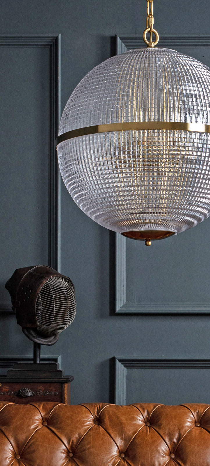
Left: A vintage Holophane globe pendant and bank of drawers sourced by Pure White Lines
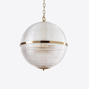
Right: One of our new Parisian globe pendants
Depth and texture
We love using anything with depth and texture, we recently designed a bathroom using Tadelakt; lime washed the walls and ceilings in another house; exposed old oak beams in an old farmhouse; poured concrete tops for another kitchen. If a mirror is distressed or antiqued, we love it more. If timber floors are sawn and have a matte finish, we love them more. We will always have an affinity to aged bronze and brass; encaustic and zelige tiles; off whites; boucles and finally the beloved holophane Parisian globe lights.
Favourite Pure White Lines piece
We bought a vintage Parisian globe light from you and it is absolutely stunning in a master bedroom scheme we designed. If I had to choose others, I’d go for the 1950’s Czech Railway Mirror and the hand painted Red and Pink Gold Leaf ‘Girls Club’ Sign for a bar or games room (if someone were so lucky to have that!). We have actually had the chance to design a few games rooms and bars for clients, which is the perfect opportunity to have loads of fun with lighting and old vintage mirrors/wall decor. I actually specified both of these items for a space that had a small bar and a pool table!
To find out more about Rose + George and their projects click here or follow them on Instagram.
Featured products…
