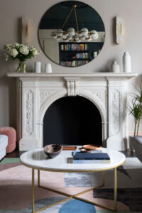
INTERIOR VIEWS WITH FRANK & FABER
Having switched careers from events specialist at the Guardian, Sarah Ellison established her design studio – Frank & Faber in 2015 and hasn’t looked back. We talk to Sarah to find out more about her design process and how she encourages her clients to identify their own style and create spaces that stand the test of time…
THE ORIGINS OF FRANK & FABER
Like many people my move into interior design started with a long-term hobby-based passion for interiors. I used to drive my friends, family, and partner mad with my constant need to re-decorate and personalise my own spaces. Always subscribing to a plethora of magazines every month, attending shows and spending weekend city breaks on the hunt for the best vintage markets.
I put my passion into practice eleven years ago when I bought my first home. A wreck which needed a full gut renovation, despite having no formal training at that stage I set about doing it up with gusto. I wanted to steer well clear of a soulless box and design a space that felt lived-in right from the start. Mood boards galore were accompanied by hours and hours on Ebay and Preloved sourcing reclaimed pieces and a very hands-on project management process – we lived in the house throughout the renovation, so we basically spent a year living with our builders – I even learned some Polish which was an added bonus.
Whilst not without its trials and stress points I absolutely loved it. I was over the moon when I saw my vision come together and it totally cemented my passion for interiors.
My career up to that point had been in marketing and events – firstly in the Music industry for Virgin and then at the Guardian, where I ran the sponsorship and events team. Despite having a job I loved, I decided to take the plunge, leave my job to do a diploma at KLC and the rest is history.
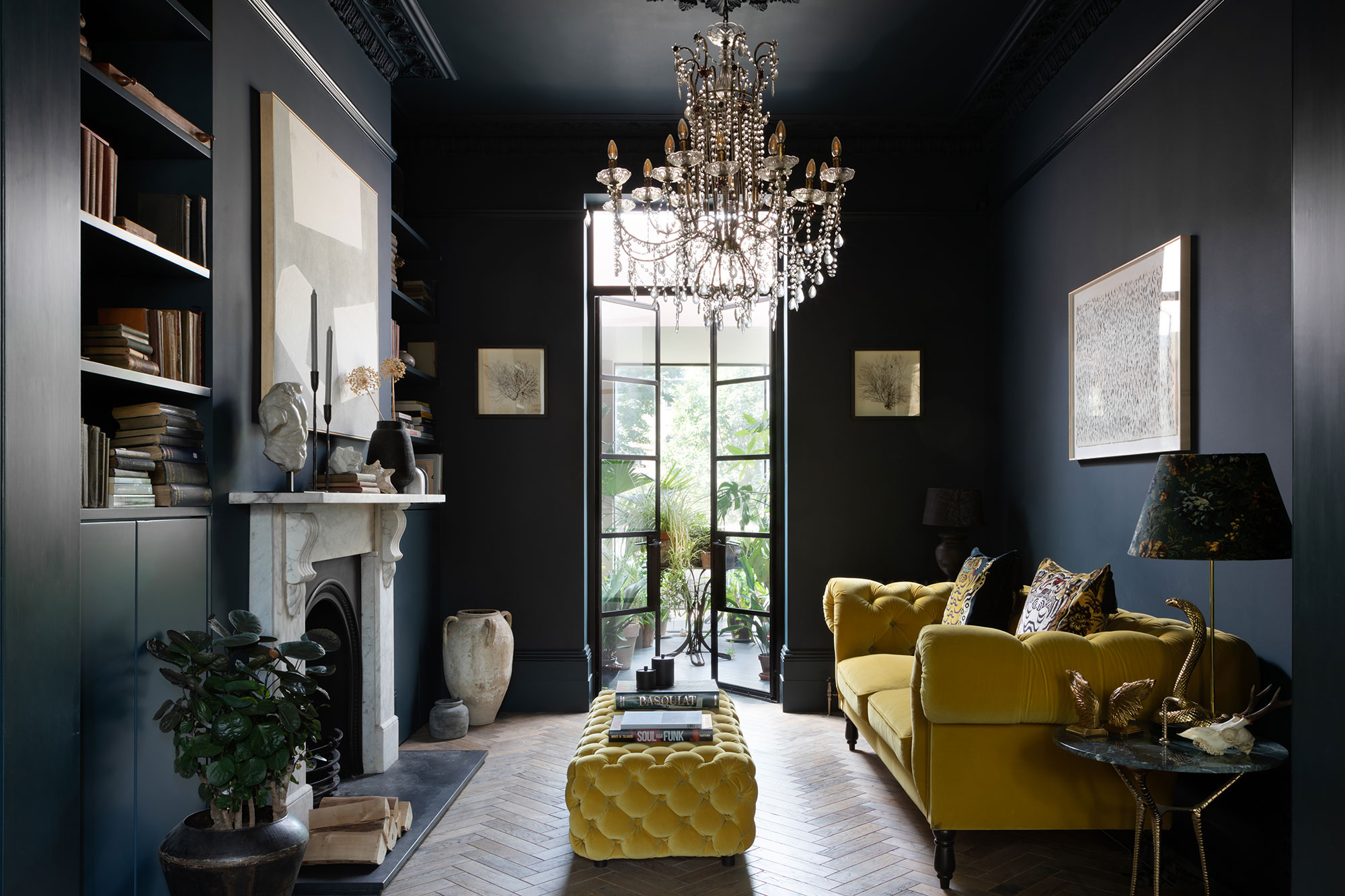
“Our spaces are beautiful, comfortable, characterful, and warm spaces that people really want to spend time in“
Photography: @paullmcraig
FRANK & FABER PROJECTS
At Frank & Faber we work on a range of high-end residential and boutique commercial projects. We are incredibly people focussed – inspired by our clients and their stories and the stories of the spaces they inhabit. We provide a unique level of service, guiding our clients through the process and listening to their needs and desires to deliver exceptionally personal projects which bring their dream spaces to life.
We work on high end residential and unique commercial projects including the recently opened boutique hotel in Somerset – Number One Bruton, Michelin starred restaurant Osip, George Northwood’s salon in Central London, the Bodyism club and café in Notting Hill. Many of our clients span commercial and residential, we might work with them on their commercial space first and then move onto their home and vice versa.
Our projects range in style and scale but are all unified by some inherent principals. Our spaces are beautiful, comfortable, characterful, and warm spaces that people really want to spend time in. Although in the background attention is paid to every detail, we avoid anything too contrived or that feels overtly ‘over-designed’, instead preferring a relaxed and lived-in warmth.
There is an investment in quality materials, wherever possible we use honest, natural materials, which have an innate character and bring a sense of luxury to the everyday – aged timbers and warm metallics, layered textures and a boldness in colour and pattern introduced the textural accents.
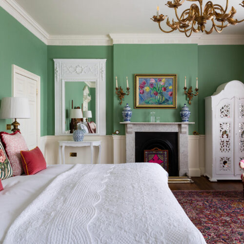
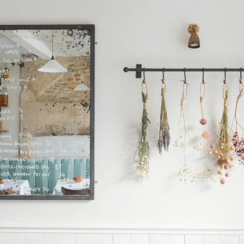
Number One Bruton, a Georgian townhouse, medieval forge and row of cottages converted in to a twelve-bedroom hotel and restaurant – Osip.
Photography: @emmalewisphotographer
PERIOD OR MODERN?
We love characterful buildings and characterful clients and the combination of those equate to our perfect projects and we have been incredibly lucky working with amazing, talented, inspiring clients in buildings which are bursting with history.
Our recent project designing the boutique hotel Number One Bruton and adjoining restaurant Osip was one such example. It was such an inspiring project with some many creative threads to pull on. The listed building is an old ironmongery and forge with history seeping out of every scuffed floorboard and cracked wall. A combination of 3 separates buildings – an old ironmongery shop, Georgian home, workshops and the original Forge. Every room is different and designed in sympathy with the heritage and style of the building they inhabit.
Our clients on this project are as characterful as the building they own and we shared a joint vision of creating a luxuriously comfortable, unique and striking home from home environment which honoured the buildings heritage and location whilst simultaneously reflecting their own story. The town of Bruton, Somerset is awash with talented creatives many of whom we collaborated with and the beautifully idiosyncratic space has personality in abundance.
Throw in a Michelin starred chef who wanted his first space to feel honest, down to earth and to reflect his farm to table cooking… his desires mirrored ours perfectly. What’s not to love?
It was a hugely collaborative project, such a personal undertaking for our clients, they put their heart and soul into it and it’s fair to say we did too. We take a holistic approach and think about our client’s and their client’s experience. What do they see, touch, smell when they journey through a space? This is particularly important in a hotel so it really suited the way we work, and we would love to do more hotel projects.
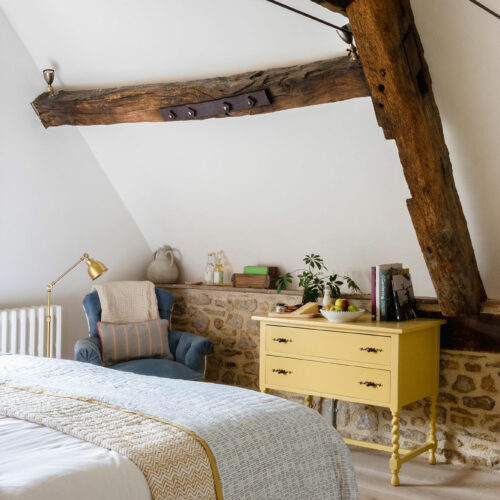
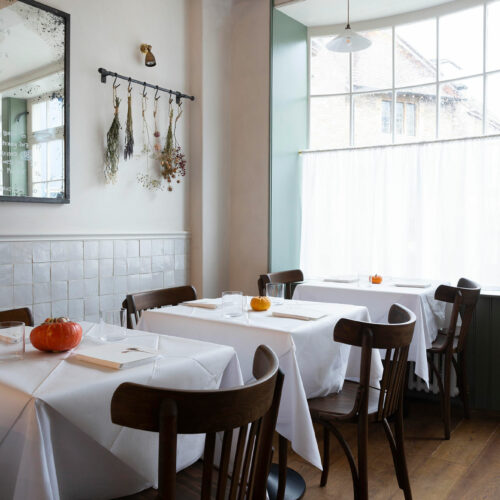
“Our clients on this project are as characterful as the building they own and we shared a joint vision of creating a luxuriously comfortable, unique and striking home from home“
Photography: @emmalewisphotographer
DESIGNING YOUR CLIENTS IDEAL LIVING ROOM…
The starting process for all our projects is the same, there is always a significant research phase, we invest a lot of time and energy getting to know and understand our clients or their brands and getting to the heart of their values and aspirations from an aesthetic and practical perspective.
Living rooms are often reserved for more evening focussed activities – entertaining friends, reading, film watching with the family. Less subject to the rigours of day-to-day life they lend themselves to a more glamorous aesthetic with a materiality and palette which is cossetting, elegant and luxurious whilst remaining cosy and inherently comfortable.
Texture and softness are critical, we love to use long drapes on windows alongside soft rugs, textured lamp shades and plenty of cushions which layer colour and pattern on pattern to ensure an overall softness, inviting comfort as well as a striking overall aesthetic.
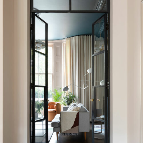
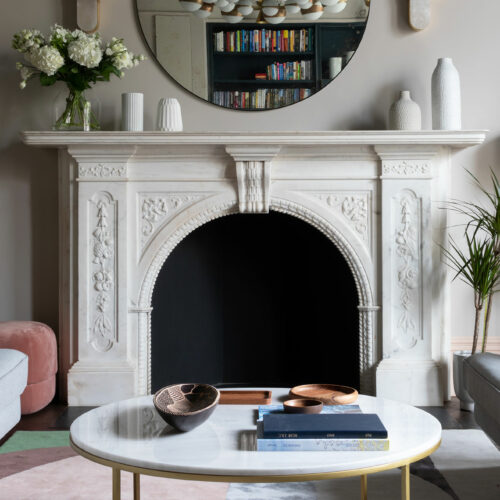
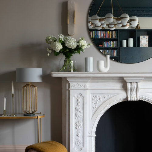
Less subject to the rigours of day-to-day life they lend themselves to a more glamorous aesthetic with a materiality and palette which is cosseting, elegant and luxurious…
Photography: @paullmcraig
ADDING WARMTH, CHARACTER AND DEPTH…
We are not wedded to one approach when it comes to colour and pattern as long as the scheme has warmth, character and depth. A predominantly neutral scheme with beautiful natural materials and layered textures can be the perfect solution for a certain type of architecture and location and be absolutely stunning in its simplicity. At the same time we simultaneously love schemes with a bold mix of strong colours and layered patterns. Choice of colour and pattern are informed by the client and brand’s personality, the building and the natural light available. We are lucky enough to work across a range of tastes and styles and actively enjoy that.
We also embrace the bold which could mean using a single hue consistently across all surfaces creating a simple but bold aesthetic or an intense mix of pattern on pattern with intentionally clashing colours. Wherever possible we love to ground a scheme with a classic pattern – stripes being a firm favourite, they have a timeless quality and happily bridge the traditional and contemporary.
As always inspiration comes from nature and as Autumn takes hold we are drawn to the earthy, autumnal shades – burned oranges, deep olive greens and the love of the perfect dirty pink withstands.
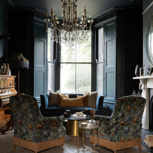
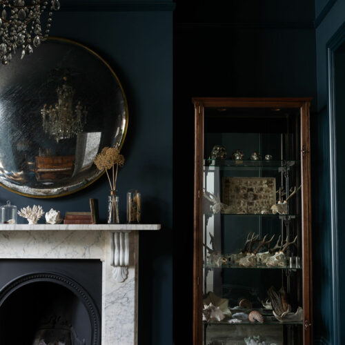
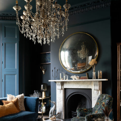
“As always inspiration comes from nature and as Autumn takes hold we are drawn to the earthy, autumnal shades”
Photography: @paullmcraig
CREATING THE PERFECT LIGHTING SCHEME…
Lighting is totally critical to achieving the balance of function and aesthetic. A good lighting scheme should be layered with a balance of task, general and feature lighting with a combination of ceiling, wall, table and floor lamps as well as up lighting in some cases.
Whilst spotlights can be incredibly useful from a functional in more task based locations we try to avoid them in ‘softer’ areas, instead opting for wall and decorative ceiling or floor lamps which are more directive and create beautiful pools of soft lighting and a general glow rather than an overall wash. In all locations we prefer lighting to be designed specifically to the layout and furniture arrangement of the space, making sure we are lighting specific features, finishes or functions rather than a general wash.
Colour temperature is also important, and we would opt for a 2700K or less to make sure that you have a flattering and inviting warmth.
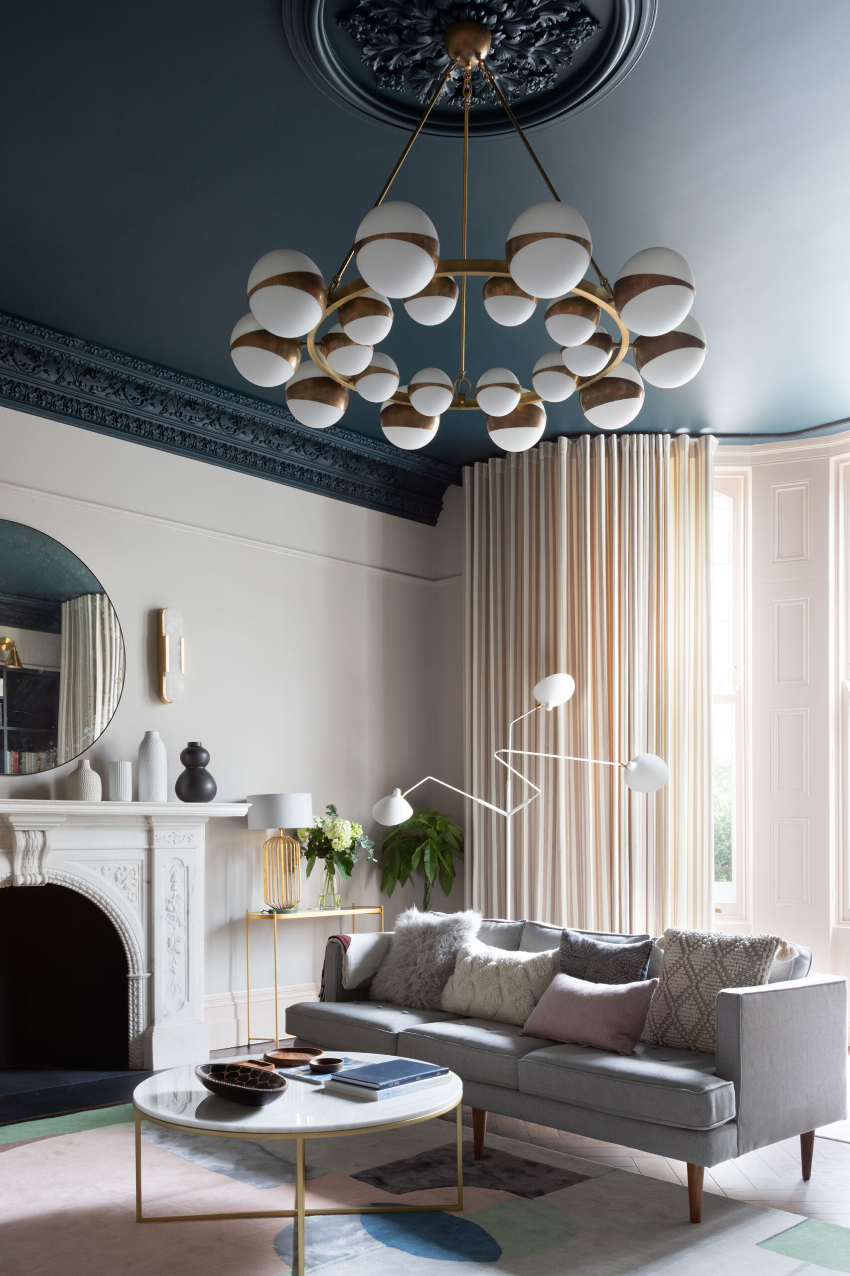
Decorative ceiling or floor lamps which are more directive and create beautiful pools of soft lighting and a general glow…
A bespoke Sputnik chandelier made by Pure White Lines for Frank & Faber. Photography: @paullmcraig
COMBINING OLD AND NEW…
I have just moved to a new house which needs a full refurbishment (we are in the early planning stages now – watch this space). It’s a lovely Victorian property blessed with gorgeous original period details and we will definitely be retaining and enhancing those within the design. With the period shell restored to its full potential this provides the perfect backdrop to introduce more contemporary fixtures and finishes.
We create characterful spaces which tell a story and for us that always means mixing old with new. We intentionally mix periods and style to curate spaces which are unique and personal to their inhabitants. That might be sourcing a statement beautiful antique which becomes the singular investment piece and the focal point which holds the scheme together or a more subtle mix of reclaimed and new
TIMELESS STYLE OVER TRENDS…
Authenticity is timeless and if you use honest materials, design in sympathy with the architecture and let your own taste be the filter, rather than following a trend then you will end up with a home you love for the long term.
We are all inundated with influences from Pinterest, Instagram as well as traditional print all of which can be invaluable as sources of inspiration but also overwhelming for clients. A key part of our job is to cut through that noise and help clients really identify their own style. This will be set alongside the heritage of the building and location of the property which will then guide the design process.
FAVOURITE PURE WHITE LINES PIECES…
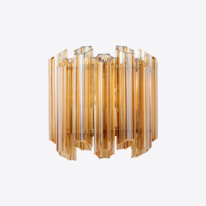
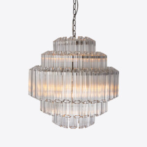
We love the bespoke Sputnik Chandelier (picture above) which we used on a previous project, and I am eyeing up the Palermo chandelier and or Palermo wall lights for my own house!
FRANK & FABER’S UPCOMING PROJECTS…
Lots of exciting projects on the go. We are close to completing an amazing project in Hampstead, it’s a large residential property that has been designed as a second home for two brothers and their families. Its design is unique because it can function as one single house or two separate ones. Our clients love unique antiques and vintage hand-crafted pieces and we have been in the amazing position of being able to source reclaimed treasures from all over the world. We are working with a very talented architect and the design is going to be really open plan and flooded with light.
A large Georgian Estate which will be filled with bold colour and pattern on pattern. Residential projects in St John’s Wood and Greenwich and (fingers crossed) some more hotel work in the off-ing.
You can view more of Sarah and Frank & Faber’s work via their website or Instagram.
Browse our selection of lighting, mirrors, furniture and decor to get the perfect layered living room…
